
New York Times Magazine redesigns for the Web


One of the most renowned magazines in the world, The New York Times Magazine, has undergone a redesign with two key aims: to carve out a distinct identity, and to embrace the current digital climate.
When a publication with this lengthy a history — it’s been in print for 119 years, its print version is inserted into the Sunday edition of the New York Times as a supplement, and currently boasts a circulation of more than 1.5 million copies per week — goes through a redesign, much care and thought has to be invested to ensure that its readers aren’t upset.
Branding for the Web
The new look of the publication primarily centered on three, crucial areas:
- its logo;
- its suite of fonts;
- its abbreviated social media logo.
All told, the changes have worked well together to give the magazine a facelift that’s more in tune with the demands of the Web, but doesn’t make longtime readers feel like they’re reading something alien.
Revised logo
Readers will be taken by the most notable of all three changes, which is the update to the magazine’s logo. Whereas the old logo had letters that were spaced together very tightly — and, as a result, was harder to read — the new logo design features more generous tracking. This greatly increases legibility on the Web.
According to an editorial by editor Jake Silverstein that takes readers behind the scenes of the revamping, “…the new logo is more modern, more graciously spaced.” Credit for this logo update goes to typographer Matthew Carter.
New typefaces
The changes to typeface didn’t stop at the logo of the magazine. The publication has also introduced a whole new suite of original fonts. The typefaces were the creation of Henrik Kubel from A2-Type. The magazine got rid of their entire slew of old fonts to make room for this sweeping design change.
As you can see, the new collection of fonts boasts slab serifs a more modern sans serif face and pleasing serifs.
According to the same editorial by Silverstein, “Not a single letter in this relaunch issue has ever seen the light of day. They are infants. Treat them gently.” Interestingly, none of the new fonts has even been named yet. The inside joke at the magazine is that they were close to christening their new typeface “really crappy font” to prevent another outfit from ever using it, should the magazine somehow let its exclusivity get compromised.
All jokes aside, though, the reason behind the new direction in typeface is a practical one: The editor wanted to ensure that The New York Times Magazine had a more literary feel — that makes sense when you consider how the magazine is substantially different from its sister newspaper.
Unlike the paper, whose stock in trade is shorter, more journalistic articles that focus on reporting and features, the magazine’s aim has always been to publish “work with more writerly ambition than you usually see in newspapers.” By using this new collection of fonts for this publication, Silverstein is able to make readers distinguish between it and coverage found in The New York Times’ online editions. Surprisingly, Silverstein admits that, up to this point, many of the magazine’s readers had a hard time understanding that they were reading content separate from The New York Times’ articles.
Redesigning for the Web
That brings us to the next goal that the editor wanted to accomplish in this redesign: making the magazine more friendly to readers on the Web, one thing that the magazine struggled to successfully pull off…until now, they hope.
an increasing number of Times’ readers have switched to digital-only
Traditionally, The New York Times Magazine, for all its longevity, has only always been a so-called “in-betweener.” It was both trapped in the middle of the Times’ bulky Sunday print edition, as well as being a “long-form subsite” on the Times’ website. Because an increasing number of Times’ readers have switched to digital-only, Silverstein wanted to build up the magazine’s branding on the Internet, through its web edition. That’s where having a new family of custom typeface will prove so instrumental.
Shorter social media logo
As part of this new strategy to build up the web presence of the publication, it’s no surprise that Silverstein also focused on social media in the redesign, particularly the magazine’s social media logo.
Such a condensed version of the magazine’s logo is perfect for more casual settings like its Twitter page. Whereas the longer, redesigned logo with the more generous tracking would be overwhelming for a smaller profile photo, the condensed version is nicely truncated for a social media audience that’s looking for brevity.
Cleaner page layout
Now, a part of the redesign of the magazine also goes beyond just the typography. In keeping up with the design trends of minimalism in the last, few years, Silverstein also decided to introduce a much cleaner layout to the magazine’s pages.
Sporting a more stripped-down look, the publication’s pages now feature fewer columns than in the past. Currently, readers will only see seven columns, but past editions featured as many as 12. The redesign team decided that having 12 columns on a page made the magazine appear too congested and excessively symmetrical. By reducing the number of columns, each page can now “breathe,” which is vital to providing the design with a cleaner appearance.
trying to make itself more friendly to Web readers, the magazine is striving to reflect the environment around it
For a publication that’s been around for more than a century—and with no signs of slowing down—The New York Times Magazine sure hasn’t been resistant to change, to its credit. Its last redesign was almost four years ago, and the editor’s decision for another redesign so soon after is a sign of the publication’s commitment to keeping up with the times (no pun intended).
The mission of the redesign was to make the magazine stand out and emerge from the shadow of its more well-known parent, The New York Times. By constantly evolving in its design approach, The New York Times Magazine ensures that it still stays relevant to readers, even 119 years after first being published. By updating its look to simpler and cleaner minimalism while also trying to make itself more friendly to Web readers, the magazine is striving to reflect the environment around it.
| 22 Robot Toon Characters in 2200+ poses – only $24! |
Source: http://www.webdesignerdepot.com/2015/02/new-york-times-magazine-redesigns-for-the-web/
Anyone can join.
Anyone can contribute.
Anyone can become informed about their world.
"United We Stand" Click Here To Create Your Personal Citizen Journalist Account Today, Be Sure To Invite Your Friends.
Before It’s News® is a community of individuals who report on what’s going on around them, from all around the world. Anyone can join. Anyone can contribute. Anyone can become informed about their world. "United We Stand" Click Here To Create Your Personal Citizen Journalist Account Today, Be Sure To Invite Your Friends.
LION'S MANE PRODUCT
Try Our Lion’s Mane WHOLE MIND Nootropic Blend 60 Capsules
Mushrooms are having a moment. One fabulous fungus in particular, lion’s mane, may help improve memory, depression and anxiety symptoms. They are also an excellent source of nutrients that show promise as a therapy for dementia, and other neurodegenerative diseases. If you’re living with anxiety or depression, you may be curious about all the therapy options out there — including the natural ones.Our Lion’s Mane WHOLE MIND Nootropic Blend has been formulated to utilize the potency of Lion’s mane but also include the benefits of four other Highly Beneficial Mushrooms. Synergistically, they work together to Build your health through improving cognitive function and immunity regardless of your age. Our Nootropic not only improves your Cognitive Function and Activates your Immune System, but it benefits growth of Essential Gut Flora, further enhancing your Vitality.
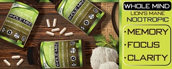
Our Formula includes: Lion’s Mane Mushrooms which Increase Brain Power through nerve growth, lessen anxiety, reduce depression, and improve concentration. Its an excellent adaptogen, promotes sleep and improves immunity. Shiitake Mushrooms which Fight cancer cells and infectious disease, boost the immune system, promotes brain function, and serves as a source of B vitamins. Maitake Mushrooms which regulate blood sugar levels of diabetics, reduce hypertension and boosts the immune system. Reishi Mushrooms which Fight inflammation, liver disease, fatigue, tumor growth and cancer. They Improve skin disorders and soothes digestive problems, stomach ulcers and leaky gut syndrome. Chaga Mushrooms which have anti-aging effects, boost immune function, improve stamina and athletic performance, even act as a natural aphrodisiac, fighting diabetes and improving liver function. Try Our Lion’s Mane WHOLE MIND Nootropic Blend 60 Capsules Today. Be 100% Satisfied or Receive a Full Money Back Guarantee. Order Yours Today by Following This Link.


| Visits: | 1,708,893,361 |
| Stories: | 8,451,476 |
Whistler Blowers, Insiders
