
Medium 2.0 launches with great features, and dreadful branding


Medium is just two years old; staggering considering that the site has redefined how we think about blogging. With an elegant editor, great dashboard tools, social connections, and no cost, it’s one of the best options available to writers.
Medium is a byword for simplicity and readability. Its careful typography, unobtrusive branding, and contextual comments have been genre defining.
But like any business, Medium wants to move forward.
Today Medium have announced their 2.0 reboot, delivering new features and enhancing old favorites across the publishing platform; and the news is (mostly) good.
Echoing a wider trend in the industry, Medium reports that readers spend more time on their mobile apps than the website, so Medium’s iOS and Android apps have been updated to enable writing and editing on mobile, in addition to reading.
Those who prefer to use the web dashboard will notice tons of improvements to the writing experience, most notably adding TK; TK is publishing notation for “to come” and provides a way for writers to note parts of a story that need to be finalized. Simply add “TK” to a paragraph or heading, and Medium will warn you that your post might not be ready, if you try to publish it.
All of the typography has been reassessed, and two new typefaces have been introduced. Display text is now set in Kievit, body text is now set in Charter — expect this pairing to be massively emulated in the next six months.
Today’s Medium typography refresh is an evolution. We set out to support a wider variety of stories, bring richer typography to Medium — Brad Birdsall
Medium is primarily about reading, so getting the typography right was a pivotal task for the design team. Marcin Wichary has written a great post on the details in the typefaces, which highlights some of the complexities involved in selecting fonts for multiple languages.
What’s really interesting is that for their UI, Medium has elected to use system fonts, meaning that Medium’s interface blends with the native UI. Rather than a distinction being drawn between Medium and the native OS, the distinction is drawn between the story and the UI. It’s an inventive way of focusing attention on content.
One of the biggest changes is that Medium has embraced the language of Twitter. You can now @ someone and (hopefully) elicit a response, moving Medium away from anecdotes, and towards the conversations that their contextual comments have always favored.
There’s also a new publishing API, allowing you to build an editor that will publish straight to Medium, or hook up a platform like WordPress and syndicate content onto Medium’s platform. If you want to, you can even use a custom domain with your account.
Finally, there’s a new logo…
Medium’s new logo
Medium’s original logo uses the uppercase ‘M’ from the Stag typeface. It’s a little lopsided in isolation, but it’s bold, recognizable, and appropriate — it conveys Medium’s emphasis on typography, minimalism, and journalism.
Medium’s original logo
The new logo, developed by the in-house team in conjunction with type foundry PsyOps is a geometric logomark, coupled with a geometric sans-serif logotype. The new logo is proof positive — if proof were needed — that good math does not equate to good design.
Medium’s new logo in development
The process of redesigning the logo has been documented by the team and it’s clear from the early designs, and the “just for kicks” video they’ve put together, that the team had some dynamic, exciting, and appropriate ideas that deserved to be fully investigated. Whether they ran out of time, or suffered a management hatchet-job is unclear, but the final logo looks like a poor first draft.
The vibrant colors have been reduced to monotone. And to add insult to injury, they’ve rounded the corners on the logomark, destroying the isometric effect that might have emerged given sufficient iterations.
Medium’s new logotype feels just like Facebook’s, and Google’s, and Opera’s; it’s an inoffensive, corporate, geometric sans that speaks little to the product it claims to represent.
Medium’s new brand is weak, clichéd, and inappropriate; happily branding can be revised. What matters most is the product, and the updated Medium raises the benchmark for online publishing once again. Medium is likely to remain the accepted standard for blogging, for some time to come.
| Exclusive Bundle: 10 Fantastic Fresh Script Font Families – only $24! |
Source: http://www.webdesignerdepot.com/2015/10/medium-2-0-launches-with-great-features-and-dreadful-branding/
Anyone can join.
Anyone can contribute.
Anyone can become informed about their world.
"United We Stand" Click Here To Create Your Personal Citizen Journalist Account Today, Be Sure To Invite Your Friends.
Before It’s News® is a community of individuals who report on what’s going on around them, from all around the world. Anyone can join. Anyone can contribute. Anyone can become informed about their world. "United We Stand" Click Here To Create Your Personal Citizen Journalist Account Today, Be Sure To Invite Your Friends.
LION'S MANE PRODUCT
Try Our Lion’s Mane WHOLE MIND Nootropic Blend 60 Capsules
Mushrooms are having a moment. One fabulous fungus in particular, lion’s mane, may help improve memory, depression and anxiety symptoms. They are also an excellent source of nutrients that show promise as a therapy for dementia, and other neurodegenerative diseases. If you’re living with anxiety or depression, you may be curious about all the therapy options out there — including the natural ones.Our Lion’s Mane WHOLE MIND Nootropic Blend has been formulated to utilize the potency of Lion’s mane but also include the benefits of four other Highly Beneficial Mushrooms. Synergistically, they work together to Build your health through improving cognitive function and immunity regardless of your age. Our Nootropic not only improves your Cognitive Function and Activates your Immune System, but it benefits growth of Essential Gut Flora, further enhancing your Vitality.
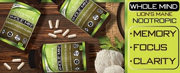
Our Formula includes: Lion’s Mane Mushrooms which Increase Brain Power through nerve growth, lessen anxiety, reduce depression, and improve concentration. Its an excellent adaptogen, promotes sleep and improves immunity. Shiitake Mushrooms which Fight cancer cells and infectious disease, boost the immune system, promotes brain function, and serves as a source of B vitamins. Maitake Mushrooms which regulate blood sugar levels of diabetics, reduce hypertension and boosts the immune system. Reishi Mushrooms which Fight inflammation, liver disease, fatigue, tumor growth and cancer. They Improve skin disorders and soothes digestive problems, stomach ulcers and leaky gut syndrome. Chaga Mushrooms which have anti-aging effects, boost immune function, improve stamina and athletic performance, even act as a natural aphrodisiac, fighting diabetes and improving liver function. Try Our Lion’s Mane WHOLE MIND Nootropic Blend 60 Capsules Today. Be 100% Satisfied or Receive a Full Money Back Guarantee. Order Yours Today by Following This Link.


| Visits: | 1,707,939,595 |
| Stories: | 8,448,944 |
Whistler Blowers, Insiders
