
How to avoid common UX traps


How many times have you been on a website, only to leave frustrated and annoyed at the experience you received during your visit? Believe it or not, this is a fairly common occurrence, especially when websites ignore good UX practices.
If you’re involved in any aspect of a website build, it’s imperative that you avoid common UX problems, if you want to stay in your users’ good books. Let’s take a look at the 4 most common UX traps that designers fall into, and how to avoid them…
Forms
Forms are necessary for gathering information about users, clients, and customers. You can’t get around using them, but they shouldn’t be unbearable to fill out. Forms should have very few questions as to what information a website is looking for. One of the biggest problems of online forms is when there are no instructions.
Formatting
When asking someone for specific information, emphasize what it is you are looking for. If you require a special format for something, such as a date, time, or any other formatted information, it should come with an example. Nothing is more annoying than filling out a form, only to receive an error message when you’re finished.
Placeholder text
It’s nice when a designer goes a little above and beyond and gives you a hint at the type of information they are looking for, by providing placeholder text in the form field. While this is extremely convenient, there have been several times when I have encountered placeholder text that doesn’t go away when you start typing in the form field. This is a huge point of frustration for any user, because they have to stop typing, select everything, and delete it, starting all over again. They also might select the unnecessary type and delete that, causing an interruption in their thought process while filling out the form. Whenever using placeholder text to hint at the type of information you are looking for, make sure it goes away when someone selects that input field.
Error messages
There’s nothing more frustrating than trying to do something on a website, only to receive an error message, without enough information, or any at all. If a website user encounters an error, there should be an explanation of what is incorrect and how to fix it. For example, if you log into a site with a username and password, if you make a mistake with one, you should be told which. With so many logins to websites out there, it’s easy to accumulate multiple variations of usernames and passwords. There are some cases when I have had to modify my usual username and password combination, because it didn’t meet the requirements of a website’s registration, such as 2 capital letters, or a number, letter, and punctuation or symbol.
Other examples would include: if passwords don’t match, during the registration process, show an error message before submitting. Another example might be if a username is already taken, show that before someone submits their registration.
No one likes having to redo something, especially after receiving poor instructions. You’ll have a lot higher engagement if you make it easy for users to provide you with the correct information the first time.
Large, fixed navigational headers
I’m not sure how this became popular, but I’ve seen it a lot, on many sites around the web. The issue with such a large header and all of those navigational elements is when you scroll down the page, it blocks a lot of content. This is especially frustrating when there are parts you need to get to, or when the content would otherwise fill the height of the browser, but part of it is concealed by navigation.
Especially On Mobile
What’s even worse is that sometimes, when a site is brought down to mobile size, the large header is still kept in place. This is a bad experience all around, because space is already limited on smartphone screens. It doesn’t need to be taken up by a nav menu that could otherwise be hidden. If there are certain nav elements that need to stay visible, turn those into small icons, or place them somewhere out of the way.
Low contrast
My eyes are good, but I am not a fan of trying to visually discern charcoal text or icons on a black background. No one should have to go through that. Contrast is key, especially in web design.
Text
Any text should be easily read, with enough weight to make it easy to read. 100 weight fonts have virtually no place on the web (except in a few special cases). Using a super thin font on a smartphone is simply asking for trouble. There has to be enough visual contrast there for your eyes to make out the letterforms.
Color
For all elements of a website, there should be plenty of easily discernable contrast between colors. Any and all text should have a high rate of contrast from its background. That goes for any links, navigational elements or icons, too. It shouldn’t be difficult to find what you are looking for.
Calls to actions
Just like other links and navigational elements, your call to action elements should display a high level of contrast. If you want a website visitor to take action, make it prominent, easy to read, and load and clear. Far too many times you’ll see a call to action with a button that doesn’t stand out enough from the background. Sometimes, it’s not a button at all, and it’s just a simple text link surrounded by white space.
Touch targets on mobile
I see this on a lot of mobile sites and it is one of the most frustrating elements to deal with. If you have a button or a link to click, give it enough space so that users don’t accidentally hit the wrong thing. On a smartphone, make sure that any buttons or links are far enough away from the edge or the corner of their screen, so they can be easily tapped.
Many times, a button placed too close to any of the 4 corners of a screen is too difficult to tap precisely. If you have larger fingers, the smartphone may not register your action at all. This causes the user to have to tap several times to get the feature to work. Space for these elements is extremely important.
Conclusion
These common UX problems can be easily avoided with a little extra work and forethought. If you want your website visitors to use and enjoy your site, it is important to make the process easy and fluid. Avoiding having your users repeat actions and processes over again cuts down on frustration and provides the user experience everyone expects from a well-designed site.
Featured image, UX design image via Shutterstock.
| HUMONGOUS Font Bundle (30 Fonts with Extended License) – only 29! |
Source: http://www.webdesignerdepot.com/2016/03/how-to-avoid-common-ux-traps/
Anyone can join.
Anyone can contribute.
Anyone can become informed about their world.
"United We Stand" Click Here To Create Your Personal Citizen Journalist Account Today, Be Sure To Invite Your Friends.
Before It’s News® is a community of individuals who report on what’s going on around them, from all around the world. Anyone can join. Anyone can contribute. Anyone can become informed about their world. "United We Stand" Click Here To Create Your Personal Citizen Journalist Account Today, Be Sure To Invite Your Friends.
LION'S MANE PRODUCT
Try Our Lion’s Mane WHOLE MIND Nootropic Blend 60 Capsules
Mushrooms are having a moment. One fabulous fungus in particular, lion’s mane, may help improve memory, depression and anxiety symptoms. They are also an excellent source of nutrients that show promise as a therapy for dementia, and other neurodegenerative diseases. If you’re living with anxiety or depression, you may be curious about all the therapy options out there — including the natural ones.Our Lion’s Mane WHOLE MIND Nootropic Blend has been formulated to utilize the potency of Lion’s mane but also include the benefits of four other Highly Beneficial Mushrooms. Synergistically, they work together to Build your health through improving cognitive function and immunity regardless of your age. Our Nootropic not only improves your Cognitive Function and Activates your Immune System, but it benefits growth of Essential Gut Flora, further enhancing your Vitality.
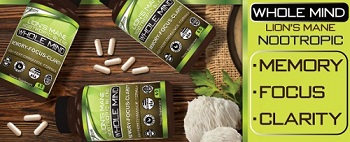
Our Formula includes: Lion’s Mane Mushrooms which Increase Brain Power through nerve growth, lessen anxiety, reduce depression, and improve concentration. Its an excellent adaptogen, promotes sleep and improves immunity. Shiitake Mushrooms which Fight cancer cells and infectious disease, boost the immune system, promotes brain function, and serves as a source of B vitamins. Maitake Mushrooms which regulate blood sugar levels of diabetics, reduce hypertension and boosts the immune system. Reishi Mushrooms which Fight inflammation, liver disease, fatigue, tumor growth and cancer. They Improve skin disorders and soothes digestive problems, stomach ulcers and leaky gut syndrome. Chaga Mushrooms which have anti-aging effects, boost immune function, improve stamina and athletic performance, even act as a natural aphrodisiac, fighting diabetes and improving liver function. Try Our Lion’s Mane WHOLE MIND Nootropic Blend 60 Capsules Today. Be 100% Satisfied or Receive a Full Money Back Guarantee. Order Yours Today by Following This Link.


| Visits: | 1,706,632,188 |
| Stories: | 8,446,070 |
Whistler Blowers, Insiders
