
Choice paralysis: 3 ways the number of choices impacts conversions


Maybe you’ve heard of a phenomenon called choice or analysis paralysis. In short, it’s a situation where a customer can’t make a decision on a purchase because he’s faced with so many choices that they end up paralyzing him. Hence, choice paralysis.
In the annals of marketing, there’s this notorious jam experiment that painfully details this phenomenon. Back in 2000, psychologists Mark Lepper and Sheena Iyengar were involved in a study where two tables of jam were presented to grocery-store customers. One had 24 choices; people who sampled from this table got a $1-off coupon. The other table only had six choices, yet people ended up buying more from the table with fewer choices!
If that grabs you by surprise, it shouldn’t, because these people were racked with choice paralysis.
This experiment has monumental implications for your web design, too, especially when it concerns landing pages. If you include many choices on said pages, you’ll make it harder for your site visitors and leads to make a decision, which can cause lost conversions and unhappy clients!
Let’s look why it’s proper to keep landing-page choices to a minimum.
Friction
Friction is defined as anything that upsets or frustrates a user’s easy path to conversions on the landing page. Friction can be anything from an unattractive site that simply drives off visitors because it looks abysmal to a total lack of clarity regarding the ultimate page goal of the landing page.
Of course, friction, more often than not, can also be caused by something like having too many choices on the page. When this occurs, as we saw in the jam experiment referenced above, visitors tend to abandon the purchase because they’re suffering from choice overload.
Friction is poison to conversions, so anything you can do to keep it to a minimum is necessary. On a landing page, that means removing choices on the page, which can include:
• No navigation menu at all
• Only one call to action button
• No contact information
Unsurprisingly, Unbounce (the specialists in landing-page design) show us how to design a landing page that’s free of friction. On their landing page for the landing-page conversion course, they’ve done away with ANYTHING at all that can cause friction to the goal of the page, which is people clicking the gigantic call to action button to begin reading the chapters in the course.
Note how you absolutely can’t click on anything on the page except for the CTA, or the specific chapter headings.
Now that boosts conversions.
Interference with the information architecture
Information architecture is defined as a site’s information backbone that essentially informs the entire user interface of a site. In other words, what your users see on the screen, or what they should see on the screen, is a direct result of the IA. Awesome IA means that the whole structure and organization of a site that define the relationship between your content and usability are excellent, too.
In the case of a landing page, this means the content has to support the usability (read: visitors being able to efficiently and easily figure out what’s expected of them on the page). If your users can’t quickly determine what they’re supposed to do on the page because there are too many choices, then the content is the problem, and it ends up hampering the relationship between the content and usability.
That’s another way of how too many choices can create an adverse impact on a site’s conversions. If users land on a page, yet their flow is interrupted due to excessive choices, chances are slim that they’ll complete the page’s goal, which is to convert.
Take a look at this Wistia landing page. It’s information architecture is excellent and is a model of what you should be aiming for in IA.
The page goal is clearly to sign up for a Wistia account, which is made clear by the big, noticeable headline. To facilitate that, there’s a giant form right underneath with a big call to action button to finish the purpose of the page’s content. In other words, when visitors look at this page, it’s impossible that they won’t know what to do, and that’s because the IA is on point. There’s to no other choice than to fill out the form!
Cognitive load
Cognitive load is usually defined as the total amount of mental processing power necessary to use a site. It impacts how easily (or hard) users can find content and complete certain tasks. It just stands to reason that, when you have more choices on a landing page, the cognitive load increases.
Now, this is where it gets really interesting. Cognitive load can be categorized into two groups: intrinsic and extraneous.
Here’s how the two are defined:
• Intrinsic – The effort of taking in new information and being mindful of its own goals.
• Extraneous – The mental processing that uses up mental resources, yet doesn’t contribute to helping users understand site content.
Naturally, when you have too many choices on a landing page, you increase the extraneous cognitive load on users because you’re subjecting them to choices that don’t help them understand the landing page’s content. For example, if the landing page has internal links or a navigation menu, then these choices simply consume a user’s mental processing without helping him understand the page’s content.
That would make inclusion of anything other than the bare minimum, the CTA, a problem. With too much cognitive load, users can’t therefore concentrate as efficiently on the ultimate goal of the page, which is to convert, thus driving conversions down.
For an example of a landing page that doesn’t subject users to extraneous cognitive load, we look at Trulia. As far as cognitive load goes, this landing page is the perfect epitome of that. The page’s only goal is to get visitors to enter an address, so the site can look up its worth for them. That means there’s no extraneous cognitive load on this page at all! The only actions are:
a) Enter your address
b) Click on the call to action button to get your answer
The only mental process users undertake is to complete the goal of the page, which they can do in a matter of seconds.
Excessive choices and conversion kills
Psychology is a huge part of web design, including designing a landing page for your clients. You have to understand how users behave on the page when they’re faced with too many choices. Even a few choices can be too many when you consider that any choice that doesn’t support the page goal is excessive and therefore contributes to lower conversions.
Case studies like this one—where lessening choices on a landing page boosted conversions by 19%—show that conversions are hurt when you have too many choices on the page. It’s best not to confuse your visitors or altogether tempt them to click away from the call to action on the page. When you design to have only minimal choices, you’re designing for higher conversions and landing-page success!
| UX Flowchart Cards to Easily Plan Your Website Structure – only $24! |
Source: http://www.webdesignerdepot.com/2016/11/choice-paralysis-3-ways-the-number-of-choices-impacts-conversions/
Anyone can join.
Anyone can contribute.
Anyone can become informed about their world.
"United We Stand" Click Here To Create Your Personal Citizen Journalist Account Today, Be Sure To Invite Your Friends.
Before It’s News® is a community of individuals who report on what’s going on around them, from all around the world. Anyone can join. Anyone can contribute. Anyone can become informed about their world. "United We Stand" Click Here To Create Your Personal Citizen Journalist Account Today, Be Sure To Invite Your Friends.
LION'S MANE PRODUCT
Try Our Lion’s Mane WHOLE MIND Nootropic Blend 60 Capsules
Mushrooms are having a moment. One fabulous fungus in particular, lion’s mane, may help improve memory, depression and anxiety symptoms. They are also an excellent source of nutrients that show promise as a therapy for dementia, and other neurodegenerative diseases. If you’re living with anxiety or depression, you may be curious about all the therapy options out there — including the natural ones.Our Lion’s Mane WHOLE MIND Nootropic Blend has been formulated to utilize the potency of Lion’s mane but also include the benefits of four other Highly Beneficial Mushrooms. Synergistically, they work together to Build your health through improving cognitive function and immunity regardless of your age. Our Nootropic not only improves your Cognitive Function and Activates your Immune System, but it benefits growth of Essential Gut Flora, further enhancing your Vitality.
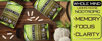
Our Formula includes: Lion’s Mane Mushrooms which Increase Brain Power through nerve growth, lessen anxiety, reduce depression, and improve concentration. Its an excellent adaptogen, promotes sleep and improves immunity. Shiitake Mushrooms which Fight cancer cells and infectious disease, boost the immune system, promotes brain function, and serves as a source of B vitamins. Maitake Mushrooms which regulate blood sugar levels of diabetics, reduce hypertension and boosts the immune system. Reishi Mushrooms which Fight inflammation, liver disease, fatigue, tumor growth and cancer. They Improve skin disorders and soothes digestive problems, stomach ulcers and leaky gut syndrome. Chaga Mushrooms which have anti-aging effects, boost immune function, improve stamina and athletic performance, even act as a natural aphrodisiac, fighting diabetes and improving liver function. Try Our Lion’s Mane WHOLE MIND Nootropic Blend 60 Capsules Today. Be 100% Satisfied or Receive a Full Money Back Guarantee. Order Yours Today by Following This Link.


| Visits: | 1,707,745,180 |
| Stories: | 8,448,501 |
Whistler Blowers, Insiders
