

Why Typography Is the Most Underrated Tool in a Designer’s Kit

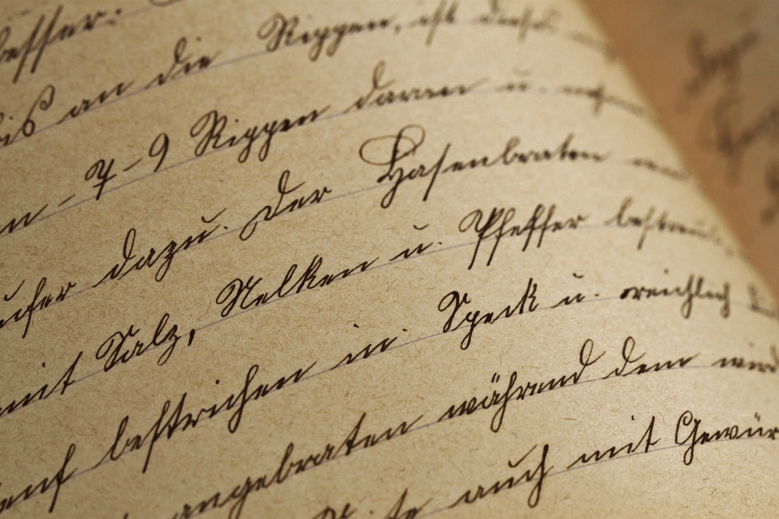
Typography is the secret weapon of every great design.
Designers agonize over colours palettes, images, layouts… One element they’ll commonly miss however is the thing that can make or break your design — typography.
Here’s the truth:
Good typography has the power to make an already good design awesome. Bad typography can ruin a design in seconds flat even if the rest of it is gorgeous.
Perhaps the most obvious place you’ll find this is with book covers. Good typography gives a reader all the information they need before they’ve even read the title.
Here’s What’s Inside:
- Why Typography Matters More Than You Think
- The Power Of Book Cover Typography
- Common Typography Mistakes To Avoid
- How To Level Up Your Typography Game
Why Typography Matters More Than You Think
Typography is not just about picking a pretty font.
Typography is communication. Every font has a personality. Letter spacing decisions alter the mood of the reader. Hierarchy influences what people notice first.
Think about it…
Whether you’re viewing a movie poster, magazine spread, or one of countless covers on your shelves, the typography is doing most of the work. It establishes tone before you’ve read a single word. Book cover typography sells your story with the first blink of an eye.
Great typography does three things:
- Creates instant emotional impact
- Guides the eye through the design
- Builds trust and credibility
Miss any of these? Your design falls flat.
Numbers don’t lie. Studies found that 57% purchase books based on their covers alone. Typography is a huge factor in that purchase.
Pretty wild, right?
The Power Of Book Cover Typography
Book cover typography is where the craft really shines.
Seconds. That’s all you have to capture a reader’s attention. On Amazon, your cover will appear as a small thumbnail on a person’s phone. If your title isn’t legible at that size, you’ve lost the sale before it begins.
That’s where typography does the heavy lifting.
Here’s what strong book cover typography actually does:
- Makes the title readable at thumbnail size
- Instantly signals the genre
- Creates a mood or tone
- Separates the book from every other cover on the page
Picture a thriller novel cover. Chunky, heavy condensed sans-serif fonts. Hard angles. Extreme contrast. Suspenseful before reading the synopsis.
Imagine a romance novel cover. Script fonts. Curly letters. Warm coloured background behind the text. Typography speaking volumes about what you are about to read.
Get the type wrong, and you send the wrong signal completely.
Statistics from large retailers indicate that typography-forward covers receive 28% greater visibility within search results compared to those with text competing against distracting images. That’s a massive advantage for something that doesn’t cost you anything extra to get right.
Common Typography Mistakes To Avoid
Even experienced designers slip up when it comes to type.
These are the most common repeated errors seen in cover work:
Too Many Fonts
This is mistake number one. Use only two fonts. Three if you’re pushing it. Know what you’re doing. Any more than three and your design becomes cluttered.
Each additional font is noise. Each additional font forces the reader to work more. When the reader must work more, they scroll away.
Poor Contrast
If the title blends into the background, nobody will read it.
Contrast isn’t negotiable. Titles need to stand out. Author names need to be readable. If someone needs to squint at their screen to read it, the design failed… regardless of how “artsy” it appears.
Ignoring Hierarchy
Every good cover has a clear reading order:
- The title
- The author name
- The tagline or subtitle
- Any awards or endorsements
When the eye has no place to go, the design is lost. Hierarchy remedies that.
Using The Wrong Genre Cues
Why would you use a flowery script font for a horror novel? Or a gritty grunge font for a cookbook?
Mismatched fonts send mixed signals to your reader and misrepresent your content. Pairing typefaces should reflect your genre. Period.
Bad Kerning
Kerning refers to the space between letters. Poor kerning can ruin an expert design in seconds.
Go ahead, manually adjust it. Defaults in software are almost never right, particularly at wider sizes.
How To Level Up Your Typography Game
Ready to make your typography actually work?
Follow these steps and you will see an instant improvement in your designs.
Study The Bestsellers
Go to Amazon and look at the current top 10 books for the genre you are designing for. What fonts are they using? What size? What weight?
Genres have conventions for a reason. Readers demand them. Bend them at your peril.
Test At Thumbnail Size
Reduce your design to 100 pixels across. Is the title still readable? Is it still clear what the book is about?
If not, back to the drawing board.
The thumbnail test is the absolute best thing you can do as a cover designer. If it looks good small, it will look good big.
Pair Fonts Thoughtfully
Typically the best font combinations can be boiled down to one simple rule – One display font for your title, one clean font for everything else.
Serif and sans-serif. Old school. Script mixed with a simple geometric font is sweet for amore. Condensed bold and a plain jane text face screams thrillers.
A few pairing tips:
- Never pair two script fonts
- Avoid pairing fonts that look too similar
- Match the mood of both fonts to the story
Use White Space
Cluttered type kills a design.
Don’t clutter up your letters. Provide negative space around your title. Allow white space to speak.
This is one of the things amateur covers tend to do wrong. They stuff every element onto the cover with no breathing room between them. Professional book cover typography looks effortless. Effortless? Ample white space.
Invest In Good Fonts
Free fonts are fine for practice.
Of course if you’re working on real projects, use beautiful professionally-made typefaces from places like Adobe Fonts or MyFonts or from individual type designers. The difference is dramatic.
Bringing It All Together
Typography is your best design tool and is vastly underutilized… Book cover typography is where it counts.
To quickly recap the key points:
- Great typography communicates before a single word is read
- Poor typography can sink even the most beautiful design
- Avoid too many fonts, bad contrast, and weak hierarchy
- Always test the design at thumbnail size
- Match your type choices to the genre
Learn these principles, and your designs will shine for the right reasons. Ignore them and even great work will become unnoticed clutter.
Typography is not decoration. Typography is design.
Read more about CAD, product design and related technology at SolidSmack.com
Source: https://www.solidsmack.com/design/why-typography-is-the-most-underrated-tool-in-a-designers-kit/
Anyone can join.
Anyone can contribute.
Anyone can become informed about their world.
"United We Stand" Click Here To Create Your Personal Citizen Journalist Account Today, Be Sure To Invite Your Friends.
Before It’s News® is a community of individuals who report on what’s going on around them, from all around the world. Anyone can join. Anyone can contribute. Anyone can become informed about their world. "United We Stand" Click Here To Create Your Personal Citizen Journalist Account Today, Be Sure To Invite Your Friends.
LION'S MANE PRODUCT
Try Our Lion’s Mane WHOLE MIND Nootropic Blend 60 Capsules
Mushrooms are having a moment. One fabulous fungus in particular, lion’s mane, may help improve memory, depression and anxiety symptoms. They are also an excellent source of nutrients that show promise as a therapy for dementia, and other neurodegenerative diseases. If you’re living with anxiety or depression, you may be curious about all the therapy options out there — including the natural ones.Our Lion’s Mane WHOLE MIND Nootropic Blend has been formulated to utilize the potency of Lion’s mane but also include the benefits of four other Highly Beneficial Mushrooms. Synergistically, they work together to Build your health through improving cognitive function and immunity regardless of your age. Our Nootropic not only improves your Cognitive Function and Activates your Immune System, but it benefits growth of Essential Gut Flora, further enhancing your Vitality.
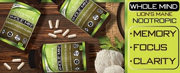
Our Formula includes: Lion’s Mane Mushrooms which Increase Brain Power through nerve growth, lessen anxiety, reduce depression, and improve concentration. Its an excellent adaptogen, promotes sleep and improves immunity. Shiitake Mushrooms which Fight cancer cells and infectious disease, boost the immune system, promotes brain function, and serves as a source of B vitamins. Maitake Mushrooms which regulate blood sugar levels of diabetics, reduce hypertension and boosts the immune system. Reishi Mushrooms which Fight inflammation, liver disease, fatigue, tumor growth and cancer. They Improve skin disorders and soothes digestive problems, stomach ulcers and leaky gut syndrome. Chaga Mushrooms which have anti-aging effects, boost immune function, improve stamina and athletic performance, even act as a natural aphrodisiac, fighting diabetes and improving liver function. Try Our Lion’s Mane WHOLE MIND Nootropic Blend 60 Capsules Today. Be 100% Satisfied or Receive a Full Money Back Guarantee. Order Yours Today by Following This Link.


| Visits: | 1,832,989,625 |
| Stories: | 8,710,398 |
Whistler Blowers, Insiders

