

What Is the Fed Dot Plot? Fed Rate Outlooks (October 2026)

The Fed dot plot is a quarterly chart published by the Federal Reserve in which individual policymakers show, anonymously, where they expect short-term interest rates to sit at the end of future years. Each dot is one person’s forecast for the federal funds rate, and the middle dot in each column is treated as the committee’s median view. Last refreshed for October 2026.
It is the closest thing the Fed has to a public map of where its own people think rates are heading, and it lands four times a year. The rest of this guide walks through what each part of the chart means, why the dots are conditional rather than binding, and how traders use them without over-reading them.
What Is the Fed Dot Plot?
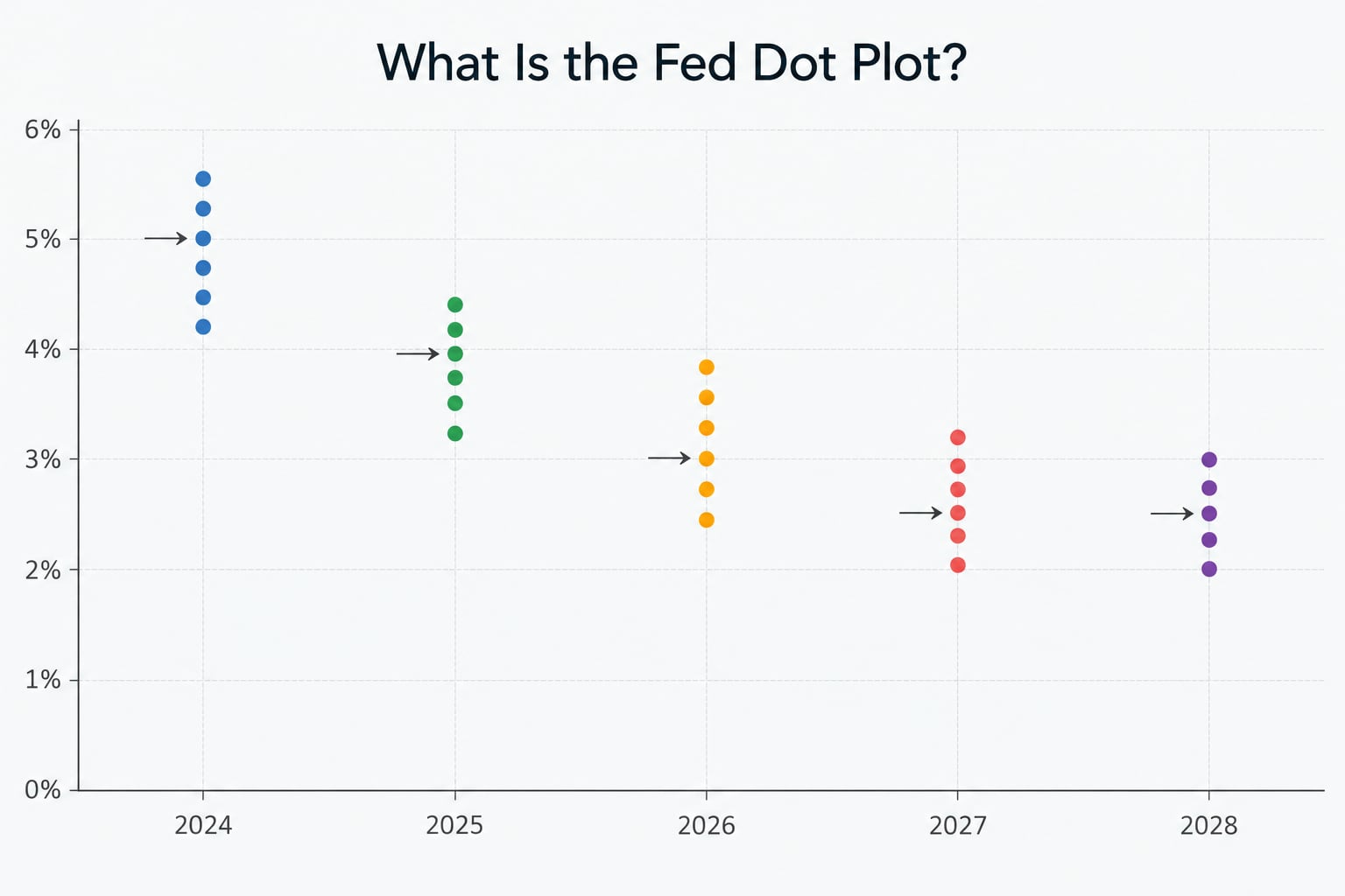
What is the Fed dot plot, in plain terms? It is a scatter chart published four times a year as part of the Fed’s Summary of Economic Projections, and it plots the median annual federal funds rate forecast submitted by individual FOMC participants for selected future years. Each dot is a forecast, not a vote.
The chart is the most quoted piece of Fed communication after the rate decision itself, and it is genuinely useful precisely because it is hard to spin. You cannot argue a dot away; you can only note that the forecast behind it assumed things that may no longer hold.
How Does the Fed Create the Dot Plot?
Before each quarterly meeting, FOMC participants submit written forecasts. The desk compiles them, strips out any identifying information and plots each submission as one dot. Nothing in the chart tells you who cast which dot, and that anonymity is deliberate.
Participants are typically the twelve voting members plus the seven other Fed governors and Reserve Bank presidents who attend the meeting, so the count can move from meeting to meeting. A governor who opts out of submitting projections simply does not appear as a dot that quarter, which is one reason the number shifts.
Each submission covers five blocks of variables: the federal funds rate, real GDP growth, the unemployment rate, headline PCE inflation and core PCE inflation, plus a longer-run rate figure. Only the interest rate column becomes the famous dots; the rest appears as a separate table.
Note what is absent: there is no vote here. The FOMC’s actual decision is recorded separately, with dissents named in the statement. The dot plot sits before and apart from that decision.
How to Read What Is the Fed Dot Plot Made Of? What the vertical scale shows
The left-hand axis is the federal funds rate in percent, marked in quarter-point steps that correspond to 25 basis points. A dot at 4.4 means a projection that the rate sits at 4.4% at the end of that year. Since 2021 the Fed has plotted the midpoint of the projected target range rather than the top or bottom edge, so treat the dot as the centre of a range, not its boundary.
What the horizontal axis shows
The columns are years: the current year, next year, two years after that, two more years out and a final column labelled longer run. The near-year columns are the ones markets trade on. The longer-run column is a different animal, closer to an estimate of where the neutral rate settles once the business cycle stops pushing.
What each individual dot represents
One dot equals one person’s projection. Dots often stack exactly on top of each other at round numbers like 4.00% or 4.50%, and the chart counts the stack. That clustering is the honest signal that a lot of officials share a view, which matters more than the median alone.
Why some dots come in different colours
The Fed groups projections into categories. Dots for the current year typically appear in one shade and later years in another, so you can compare the current-year stance against the forward path at a glance. Older releases used more colours; the practical use has not changed much.
What the footnotes tell you
The fine print carries the conditions: projections are based on each participant’s assumptions about financial conditions, the path of energy prices, inflation dynamics and fiscal policy. The footnotes also explain the conventions for the longer-run value and note that the projections are not a Committee decision. Read them once. They explain most of the confusion later.
What Do the Dots and the Median Projection Mean?
A dot is a conditional forecast: if inflation behaves roughly this way and employment roughly this way, this is where I expect the federal funds rate to be at the end of that year. The median is simply the middle dot in the column once you sort them from low to high.
Take a hypothetical column with twelve dots: four at 3.6%, three at 3.9%, two at 4.1% and three at 4.4%. Sorted, the middle two values are 3.9% and 4.1%, and the Fed’s convention reports the midpoint of those two, or 4.0%. That 4.0% figure is the number quoted on the news. It is a summary statistic, not the view of any single official.
Two things follow from that. First, the median can shift without a single official changing their mind, because one dot moving across the middle reshuffles which two values sit in the centre. Second, an even number of dots always produces a number that nobody actually submitted.
Dispersion is the underrated part. If every dot sits at the same level, the median is a genuine consensus. If dots stretch across a full percentage point or more, the median describes nobody’s actual expectation and the disagreement itself is the story. A tight cluster that jumps two notches higher says something very different from a loose spread with the same midpoint.
What Is the Summary of Economic Projections?
The Summary of Economic Projections, or SEP, is the full quarterly document that contains the dot plot. It ships four times a year, alongside the March, June, September and December FOMC meetings, normally at 2 p.m. Eastern with the policy decision.
Each SEP carries the rate medians plus projections for GDP growth, the unemployment rate and PCE inflation, with a longer-run rate value underneath. The numbers come with the current-quarter and previous-quarter versions side by side, which is where the real signal often hides: a revision is a change of mind, while an unchanged median in a new column simply reflects another year passing.
Because dots are anonymous and the participant count varies, the Fed has at times published fewer dots, held back individual projections, or shifted the presentation format. Transparency and candor pull in the same direction here, and the compromise has shifted over the years.
How Do Investors Use Fed Rate Projections?
Nobody reads the dots in isolation. The useful move is comparing the median path against what futures markets already price, because the gap between those two is where the reaction comes from.
Treasury yields tend to adjust to the change in expected policy rates rather than to the level of the dots themselves. The dollar often leans the same way as front-end yields when the two ends of the curve disagree. Growth-oriented equities and anything priced off future earnings tend to be sensitive to the discount rate implied by that path, though a hawkish print can sometimes be read as confidence that policy will work.
Precious metals tend to respond to the real rate and to the dollar side of the same move, and industrial commodities follow the growth assumptions in the SEP table more than the rate column itself. None of that is mechanical. A dot plot that surprises nobody moves very little.
The cleanest use is directional and comparative: has the median path for next year shifted up or down since the last release, and how far is it from what futures price? Everything beyond that is interpretation.
Why Does the Fed Dot Plot Not Predict Rate Hikes or Cuts?
The honest answer is that the dots are a snapshot of conditional thinking taken on a specific date. The conditions move. A forecast made under one set of inflation assumptions has little force once the data disagrees with those assumptions, and the Fed rewrites its projections every quarter rather than being held to last spring’s chart.
Terminology adds to the confusion. The target range is the band the FOMC sets; the dot plots a single midpoint within it. News coverage that says rates are “at 4.4” may be describing a range that spans 4.25% to 4.50%, which is a different statement about policy than a dot landing on the same number.
Anonymity is a second limit. With no names attached, a reader cannot tell whether the outlier dots are the newest governors or long-serving presidents, and that difference matters for how durable a view looks.
September 2026 gave a clean demonstration of how the chart and the market can point in opposite directions. After the FOMC hiked by a quarter point, Treasury yields fell rather than rose, because traders read the aggressive median path as a signal that inflation gets contained sooner and policy comes back down. The dot plot had said higher for longer; the market read the same chart as good news for bonds.
| What the dots are | What the dots are not | What the dots can signal |
|---|---|---|
| Conditional projections from individual policymakers | A vote or a binding decision | A shift in the committee’s centre of gravity since the last release |
| A median summary of the rate path | A promise about any specific year | Whether the group is tightly clustered or badly split |
| A quarterly snapshot with stated assumptions | A live, continuously updated forecast | How policymakers read growth, labor and inflation together |
| A published document anyone can check | A reliable trading system | A gap worth trading against futures-implied rates |
Frequently Asked Questions
Usually between about a dozen and nineteen, because the count depends on who submitted projections that quarter. The twelve voting FOMC members participate, and Reserve Bank presidents and governors who attend the meeting also submit. Anyone who opts out is simply absent, so the total changes from release to release.
No. A dot is an individual forecast, not a tally. The committee’s actual decision appears in the FOMC statement, and any dissents are named there. A chart where most dots sit low while the committee still raises rates is entirely possible, which is why traders read the dots as sentiment rather than as a decision.
It is the range the FOMC sets for the overnight rate banks charge one another on reserves. The Fed steers the effective rate toward that band using interest paid on reserve balances and related tools. Since 2021 the dot plot has plotted the midpoint of the target range rather than its upper or lower edge.
Fed funds futures are market prices that aggregate thousands of traders’ bets, and they update constantly. The dot plot is a quarterly publication built from a few dozen officials’ private projections. Futures tend to lead when expectations shift between meetings, while the dot plot changes only four times a year.
No. It feeds into expectations for rates, the dollar and real yields, which matter to asset prices, but the transmission is indirect and often contradictory. A hawkish path can lift yields on one day and lift equities on the next if investors read it as successful disinflation. Treat any single-asset forecast built on the dots with suspicion.
What Should Investors Do First?
Start by putting the median next to two other numbers: the current target range midpoint, and what fed funds futures imply for the same year. The story is usually in the distance between them rather than in the median on its own.
Then read the rest of the SEP before the rate column. The GDP, unemployment and core PCE assumptions are the conditions the dots depend on, and a forecast that assumes disinflation nobody else expects deserves less weight.
Keep the release dates in view, expect the next set of dots to revise the current ones, and remember that markets move on the change rather than the level. Nothing here is personal financial advice, and rates vary and change, so treat the chart as guidance rather than an outcome.
Source: https://www.pgm-blog.com/what-is-the-fed-dot-plot/
Anyone can join.
Anyone can contribute.
Anyone can become informed about their world.
"United We Stand" Click Here To Create Your Personal Citizen Journalist Account Today, Be Sure To Invite Your Friends.
Before It’s News® is a community of individuals who report on what’s going on around them, from all around the world. Anyone can join. Anyone can contribute. Anyone can become informed about their world. "United We Stand" Click Here To Create Your Personal Citizen Journalist Account Today, Be Sure To Invite Your Friends.
LION'S MANE PRODUCT
Try Our Lion’s Mane WHOLE MIND Nootropic Blend 60 Capsules
Mushrooms are having a moment. One fabulous fungus in particular, lion’s mane, may help improve memory, depression and anxiety symptoms. They are also an excellent source of nutrients that show promise as a therapy for dementia, and other neurodegenerative diseases. If you’re living with anxiety or depression, you may be curious about all the therapy options out there — including the natural ones.Our Lion’s Mane WHOLE MIND Nootropic Blend has been formulated to utilize the potency of Lion’s mane but also include the benefits of four other Highly Beneficial Mushrooms. Synergistically, they work together to Build your health through improving cognitive function and immunity regardless of your age. Our Nootropic not only improves your Cognitive Function and Activates your Immune System, but it benefits growth of Essential Gut Flora, further enhancing your Vitality.

Our Formula includes: Lion’s Mane Mushrooms which Increase Brain Power through nerve growth, lessen anxiety, reduce depression, and improve concentration. Its an excellent adaptogen, promotes sleep and improves immunity. Shiitake Mushrooms which Fight cancer cells and infectious disease, boost the immune system, promotes brain function, and serves as a source of B vitamins. Maitake Mushrooms which regulate blood sugar levels of diabetics, reduce hypertension and boosts the immune system. Reishi Mushrooms which Fight inflammation, liver disease, fatigue, tumor growth and cancer. They Improve skin disorders and soothes digestive problems, stomach ulcers and leaky gut syndrome. Chaga Mushrooms which have anti-aging effects, boost immune function, improve stamina and athletic performance, even act as a natural aphrodisiac, fighting diabetes and improving liver function. Try Our Lion’s Mane WHOLE MIND Nootropic Blend 60 Capsules Today. Be 100% Satisfied or Receive a Full Money Back Guarantee. Order Yours Today by Following This Link.


| Visits: | 1,833,882,533 |
| Stories: | 8,714,979 |
Whistler Blowers, Insiders

